National Mini Storage Website
As part of National Mini Storage’s rebrand in 2021, I was tasked with refreshing their website. This involved remapping their old website, investigating what worked and what didn’t, creating a wireframe and following that, a new design.
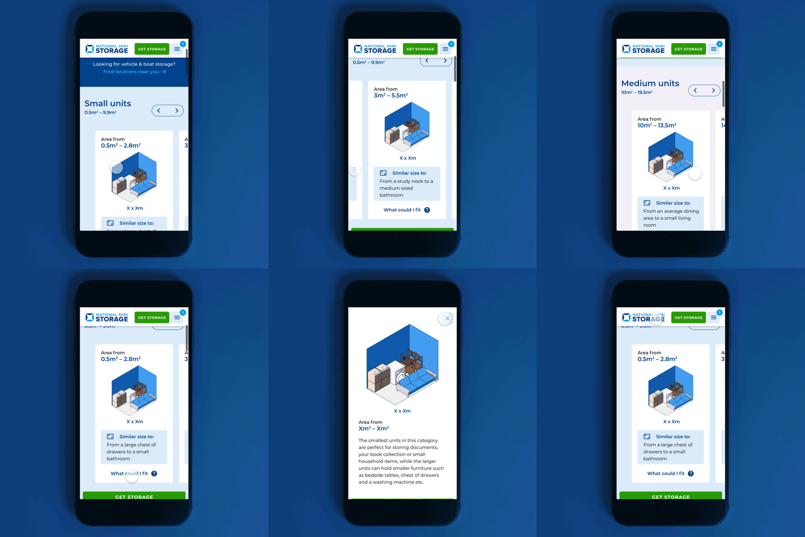
Three of the key tasks for the new website was ensuring it had a mobile friendly design, a page that serves as a guide to unit sizes, and the ability to search nearest branches by address/suburb.
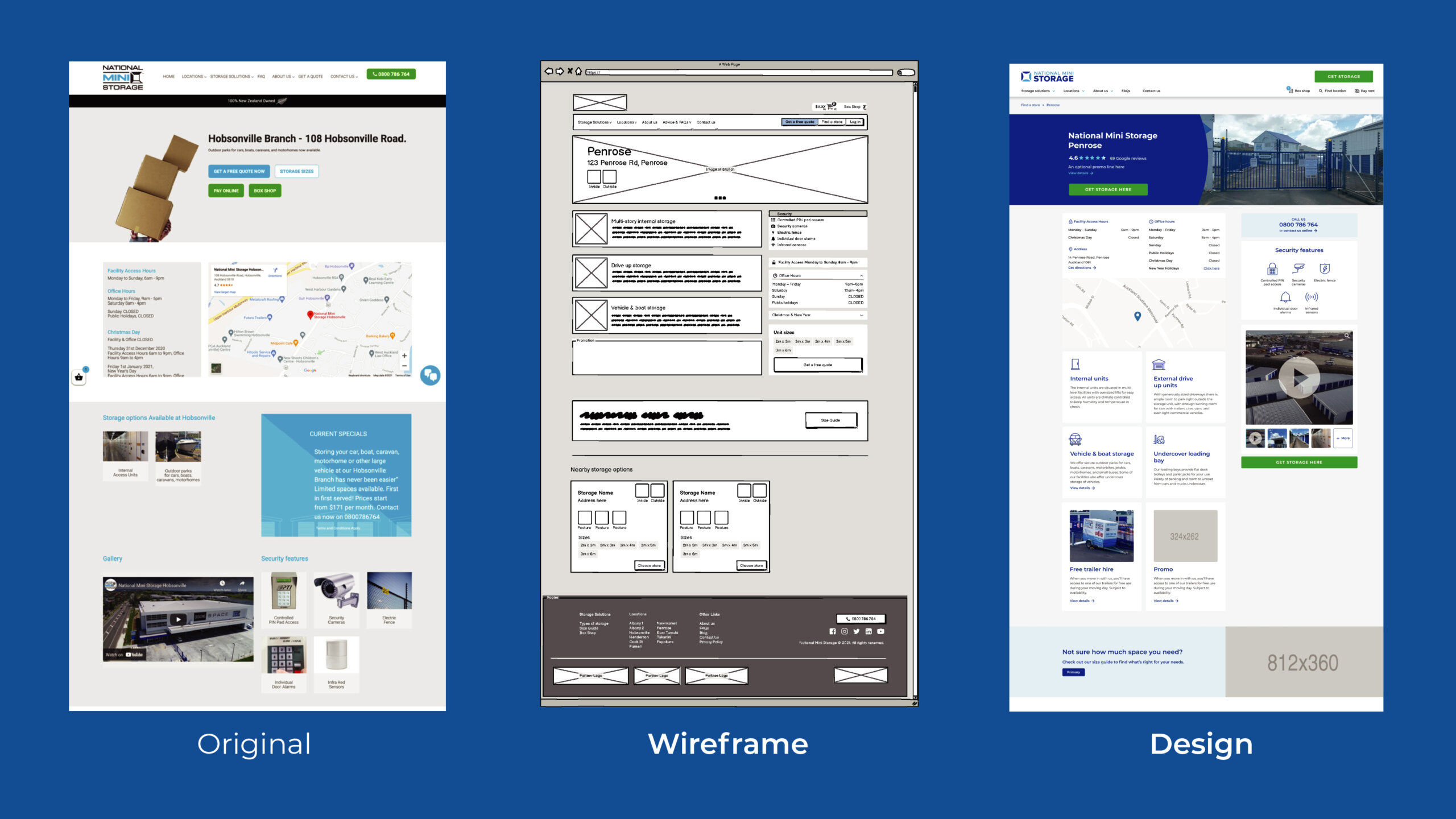
Using existing pages as reference, and studying best-practice with popular NZ websites (such as Westpac) and competitors, I created a low-fidelity wireframe and resolved the site map and menu in Balsamic.

These are video walk-throughs of the prototype (built in Adobe XD) presented to the client to show my initial thoughts and designs for the UX/UI. A web link of the prototype was also shared with the client so they could both comment on and test the design.
A mobile view of the Size Guide, choosing a location, getting storage at that location (not developed in the final website) & getting a quote and navigating to the box shop & checking out.
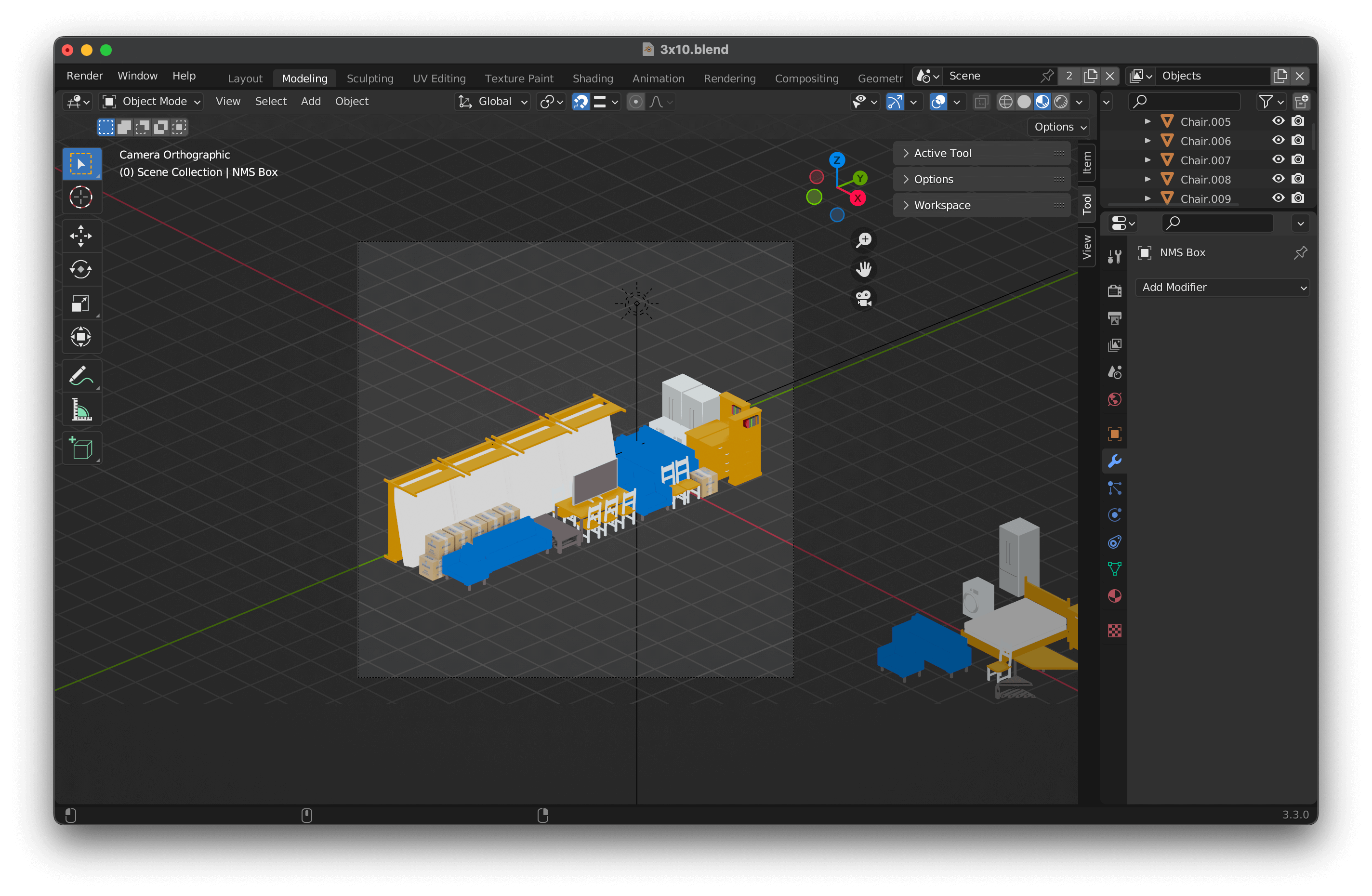
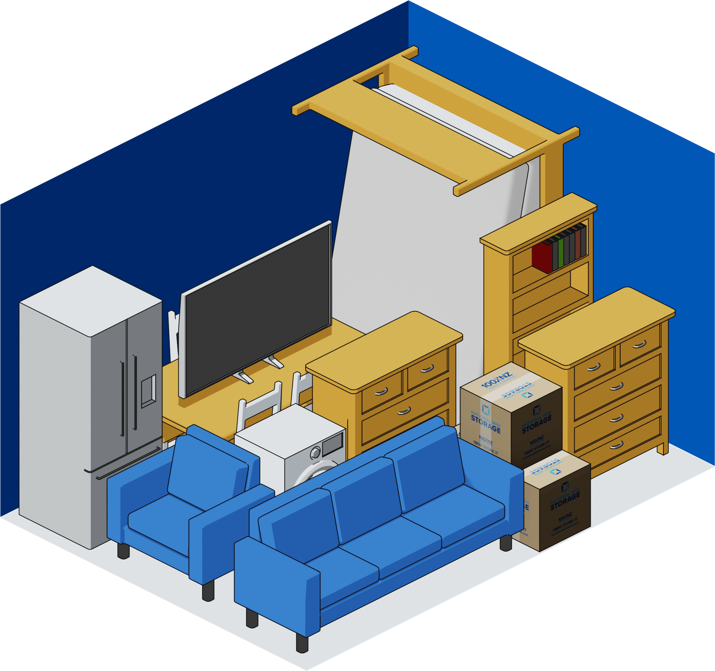
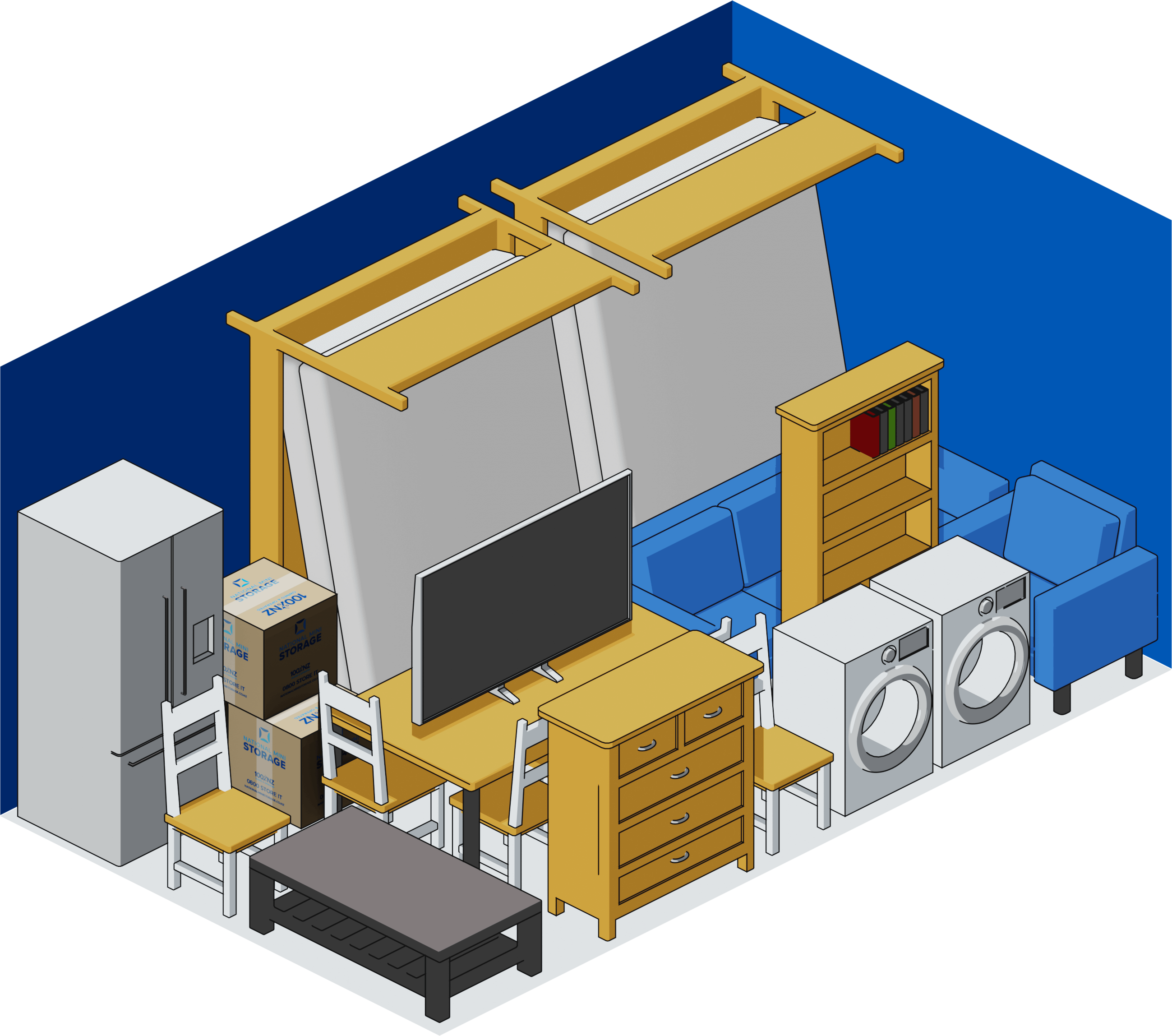
I also built the Size Guide images in Blender, as I could set up the illustration to as accurate measurements as possible (I searched for average dimensions for furniture & appliances to model, but had accurate measurements of National Mini Storage boxes and units).
Software used
 Adobe XD
|
 Balsamiq
|

|